
I had always been intrigued by the Erwin Technical School building on Hillsborough Avenue and 22nd street. I always wondered why someone would build it as a school. Well, it wasn't built as a school, it was originally built in 1959 as a Sears department store. During the 50s Sears was looking to grow with modern America. Americans loved their cars and didn't want the hassle of driving all the way to their downtown and fighting for a parking space to get Juniors new pants for the school. Thus, the big department stores decided to push out into the wilderness of the suburbs where they could build on large lots to accomodate lots of parking. Sears realized that Florida was a growing region and decided it would build a lot of new suburban style stores in the area to. I've counted at least 10 built in Florida between 1950 and 1960. Sears also knew that the styling of the stores had to be modern and reflect the new architectural style of the region. So Sears hired the law firm of Weed, Russell and Johnson out of Miami. Principal Robert Law Weed was well known for his Florida modern style, having designed the Florida Tropical showcase house at the 1933 Chicago "Century of Progress" World's Fair and collaborated on the design for the new University of Miami campus.
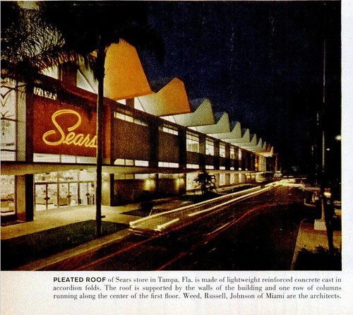
This building is the best example of Sears collaboration with the Weed, Russell and Johnson architectural firm from Miami, one of the more influential Miami Modern firms (this building is also the least altered of those still standing). The most striking feature is the repeating "W" shaped cast concrete roof, also heavily referred to as a "folded plate". The roof is supported by columns that helped create a more open floorplan. Windows cover the walls and originally went all the way up to the roofline, and large artistic sunscreens adorn the outside facade. The firm also designed the adjoining auto center in a complementary design. It features a V shaped concrete roof instead of the W shaped roof of the main building. Both structures are still intact and only slightly altered. You can find more pictures and information regarding this particular store here (thanks to JSDesign over at Flickr for his research and posts). I never really liked the design of this building before, but after discovering its origins I can't help but think it is a real gem.


(above photo courtesy of Giveawayboy)

The building is seriously creepy inside...I had a job interview there once. Very cool history behind it, though! I appreciate it much more now. :)
ReplyDeleteGlad you liked the story. I imagine the building was creepy because the interior was divided up to make classrooms and whatnot. But I'd love to hear what makes it so creepy.
ReplyDeleteHave you ever seen the neptune Publix before the remodel?
ReplyDeleteNo, I thought it always looked that way.
ReplyDelete